
Progress bars play a vital role in user experience design. They provide visual feedback, letting users know that a task is in progress, whether it’s downloading a file, loading content, or completing a multi-step process. In SwiftUI, Apple’s declarative framework for building UIs, the ProgressView component makes it easy to integrate both determinate and indeterminate progress indicators into your iOS apps.
SwiftUI’s ProgressView is a versatile and powerful tool. With it, developers can create progress bars that are not only functional but also aesthetically pleasing and responsive. Whether you need a simple linear progress bar or a custom circular indicator, ProgressView can be tailored to fit the specific needs of your app. This flexibility allows developers to maintain consistent visual themes while providing clear and informative feedback to users.
In this blog post, we will dive into the essentials of using ProgressView in SwiftUI. We will cover the basics of setting up a progress bar, customizing its appearance, and integrating it into various real-world scenarios. Whether you’re new to SwiftUI or looking to refine your app’s user interface, this guide will equip you with the knowledge to implement effective and visually appealing progress indicators. By the end of this post, you will understand how to leverage ProgressView to enhance the user experience in your apps, ensuring tasks are communicated clearly and effectively.
Contents
Understanding Progress Bars in SwiftUI
What is ProgressView?
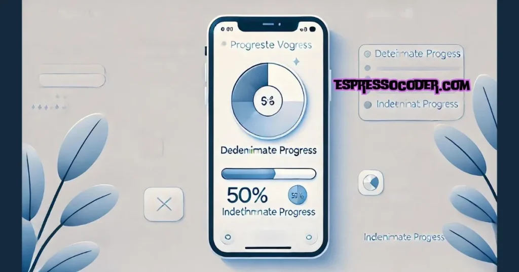
ProgressView is a built-in component in SwiftUI designed to display the progress of a task. It is versatile and can show both determinate and indeterminate progress. This means it can represent tasks where the progress is measurable or tasks where the progress cannot be quantified, like loading data.
Types of Progress Indicators
In SwiftUI, progress indicators generally come in two types: determinate and indeterminate. A determinate progress bar shows a specific value of progress, like 50% completed. An indeterminate progress bar, on the other hand, does not show specific progress but indicates that a task is ongoing, like a spinner.
Use Cases for Progress Bars
Progress bars are essential in various app scenarios. For example, a determinate progress bar is ideal for tasks like file downloads, where you can measure how much is completed. An indeterminate progress bar is better suited for tasks like fetching data from a server, where the duration is unknown. Understanding when to use each type helps in creating a more intuitive user experience.
This section introduces the fundamentals of SwiftUI’s ProgressView, preparing you to implement and customize progress indicators effectively in your apps.
Getting Started with ProgressView
Basic Implementation
To start using ProgressView in SwiftUI, you can create a simple progress bar with minimal code. The basic implementation involves setting up a ProgressView with a determinate value, which shows a specific amount of progress. For instance, you can display a progress bar at 50% completion using the value parameter:
swiftCopy codeProgressView(value: 0.5)
    .progressViewStyle(LinearProgressViewStyle())
Creating an Indeterminate Progress Bar
An indeterminate progress bar is ideal when the exact progress is unknown, such as when loading content. To create one, simply initialize ProgressView without any parameters. SwiftUI will automatically display a default spinning indicator, indicating an ongoing task:
swiftCopy codeProgressView()
    .progressViewStyle(CircularProgressViewStyle())
Displaying Progress with Labels
Adding labels to your progress bars can enhance the user experience by providing context. You can include a label directly within the ProgressView. For example, to show a label indicating what is being tracked:
swiftCopy codeProgressView("Loading Data...", value: 0.7)
    .progressViewStyle(LinearProgressViewStyle())
This section covers the creation of both determinate and indeterminate progress bars in SwiftUI, laying the groundwork for more advanced customization and usage.
Customizing Progress Bars
Using Built-in Styles
SwiftUI offers several built-in styles to customize the look of ProgressView. You can choose between a linear progress bar and a circular progress indicator, depending on your app’s needs. For instance, LinearProgressViewStyle creates a standard horizontal bar:
swiftCopy codeProgressView(value: 0.6)
    .progressViewStyle(LinearProgressViewStyle())
Alternatively, you can use CircularProgressViewStyle for a spinning indicator:
swiftCopy codeProgressView()
    .progressViewStyle(CircularProgressViewStyle())
These styles are easy to apply and help your progress bars align with your app’s design.
Creating a Custom Style
If the built-in styles don’t meet your requirements, you can create a custom progress bar style by implementing the ProgressViewStyle protocol. This allows you to define how the progress bar should look and behave, including custom colors, shapes, or animations. Here’s a simple example of a custom style:
swiftCopy codestruct MyCustomProgressViewStyle: ProgressViewStyle {
    func makeBody(configuration: Configuration) -> some View {
        ZStack {
            Circle()
                .trim(from: 0.0, to: CGFloat(configuration.fractionCompleted ?? 0))
                .stroke(Color.blue, lineWidth: 10)
                .rotationEffect(Angle(degrees: -90))
                .frame(width: 50, height: 50)
        }
    }
}
Applying Customizations
Once you’ve defined your custom style, applying it is straightforward. Use the .progressViewStyle() modifier to apply the style to any ProgressView in your app:
swiftCopy codeProgressView(value: 0.7)
    .progressViewStyle(MyCustomProgressViewStyle())
This ensures that your progress bars are consistent with your app’s theme and provide a unique user experience.
Advanced Usage of Progress Bars
Animating Progress Bars
Animating progress bars in SwiftUI enhances the user experience by providing visual feedback as progress updates. You can achieve smooth transitions by animating the progress value. For example, you can animate a ProgressView from 0 to 100% completion:
swiftCopy code@State private var progress: Double = 0.0

var body: some View {
    VStack {
        ProgressView(value: progress)
            .progressViewStyle(LinearProgressViewStyle())
            .animation(.easeInOut(duration: 1.0), value: progress)

        Button("Increase Progress") {
            progress += 0.1
        }
    }
}
Combining ProgressView with Other Views
To create a richer user interface, you can combine ProgressView with other SwiftUI components. For instance, you might add text labels, images, or additional controls alongside the progress bar. Here’s an example of combining ProgressView with a text label:
swiftCopy codeVStack {
    Text("Downloading File")
        .font(.headline)

    ProgressView(value: 0.5)
        .progressViewStyle(LinearProgressViewStyle())
}
Using Progress Bars in Complex Layouts
Progress bars can be integrated into more complex UI layouts, such as inside lists or forms. For example, you can display a progress bar within a list cell to show individual task progress:
swiftCopy codeList {
    ForEach(0..<5) { index in
        HStack {
            Text("Task \(index + 1)")
            Spacer()
            ProgressView(value: Double(index + 1) / 5.0)
                .progressViewStyle(LinearProgressViewStyle())
                .frame(width: 100)
        }
    }
}
This section covers advanced uses of ProgressView, from animating progress changes to integrating progress bars with other SwiftUI components and complex layouts, giving you the tools to create dynamic and engaging user interfaces.
Real-World Examples
Tracking File Upload Progress
One common use of ProgressView is to track file upload progress. You can show the user how much of a file has been uploaded by updating the progress value dynamically. Here’s an example where the progress is updated based on the upload completion percentage:
swiftCopy code@State private var uploadProgress: Double = 0.0

var body: some View {
    VStack {
        Text("Uploading File...")
            .font(.headline)

        ProgressView(value: uploadProgress, total: 1.0)
            .progressViewStyle(LinearProgressViewStyle())

        Button("Start Upload") {
            // Simulate file upload progress
            withAnimation {
                uploadProgress = 0.7 // 70% completed
            }
        }
    }
}
Indicating App Loading State
When an app is loading data, an indeterminate progress bar can indicate that the process is ongoing. This helps users understand that the app is working, even if the exact progress is unknown:
swiftCopy codeVStack {
    Text("Loading Data...")
        .font(.headline)

    ProgressView()
        .progressViewStyle(CircularProgressViewStyle())
}
Progress in a Multi-Step Form
In a multi-step form, you can use a progress bar to show users how far along they are in completing the form. This provides clear feedback and encourages users to finish the process:
swiftCopy code@State private var step: Int = 1

var body: some View {
    VStack {
        Text("Step \(step) of 5")
            .font(.headline)

        ProgressView(value: Double(step), total: 5.0)
            .progressViewStyle(LinearProgressViewStyle())

        Button("Next Step") {
            if step < 5 {
                step += 1
            }
        }
    }
}
This section demonstrates how ProgressView can be used in practical scenarios, such as tracking file uploads, indicating loading states, and guiding users through multi-step processes.
Common Pitfalls and Best Practices
Avoiding Overuse
While ProgressView is a powerful tool, it’s important not to overuse progress bars in your app. Use them only when necessary to avoid overwhelming users. For instance, avoid using progress bars for tasks that are too short to notice or where feedback is not needed.
Performance Considerations
When using multiple ProgressView components, especially in complex layouts, consider the performance impact. Ensure your progress bars are efficient and do not cause lag in your app. This is especially important when updating progress dynamically.
Ensuring Accessibility
Accessibility is crucial when designing progress bars. Make sure your ProgressView components are accessible to all users, including those using VoiceOver. You can achieve this by adding descriptive labels and ensuring that progress updates are communicated clearly.
swiftCopy codeProgressView(value: 0.5)
    .accessibilityLabel("File upload progress")
    .accessibilityValue("50% completed")
Conclusion
In this blog post, we’ve explored how to effectively use ProgressView in SwiftUI to enhance your app’s user interface. You’ve learned how to create and customize both determinate and indeterminate progress bars, apply built-in styles, and even create custom progress bar styles. We also covered practical examples and best practices, including performance considerations and accessibility. By implementing these techniques, you can ensure that your app provides clear and responsive feedback to users, making their experience smoother and more engaging.
FAQs
1. How do I update the progress dynamically in ProgressView?
- To update the progress dynamically, you can use a
@Statevariable to track the progress value and update it as needed. TheProgressViewwill automatically reflect changes when the state variable is updated.
2. Can I customize the color of a ProgressView?
- Yes, you can customize the color by applying a
foregroundColormodifier or by creating a customProgressViewStylewhere you define the colors used.
3. How do I create a circular progress bar?
- Use the
CircularProgressViewStyle()to create a circular progress indicator. This is ideal for showing indeterminate progress or creating custom circular indicators.
4. Is it possible to add animations to a ProgressView?
- Yes, you can animate a
ProgressViewby wrapping it in a.animation()modifier. This allows smooth transitions as the progress value changes.
5. How can I make a ProgressView accessible to users with disabilities?
- To make a
ProgressViewaccessible, use the.accessibilityLabel()and.accessibilityValue()modifiers to provide descriptive text for assistive technologies like VoiceOver. This ensures all users understand the progress being made.
6. What should I consider when using multiple ProgressView components?
- When using multiple
ProgressViewcomponents, consider the performance impact, especially in complex layouts. Ensure they are efficient and avoid updating them too frequently to prevent lag in your app.